Conversation
Notices
-
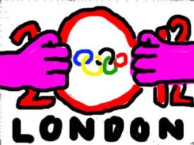
Oh man, I JUST noticed that the 2012 olympics logo is actually just a stylized "2012".
Friday, 03-Aug-12 01:07:32 UTC from web-
@abigpony It's the laziest logo ever, and yet somehow it won the logo design contest because it was "futuristic and representative of the UK's diversity" or something along those lines. #IDontEven
Friday, 03-Aug-12 01:10:04 UTC from web-
@bitshift At first I thought it was a crumbled building or something and I was all "well that doesn't seem like a very good logo" but then I saw the 2012 and I was all "well that's a... nice... style?"
Friday, 03-Aug-12 01:12:34 UTC from web-
@abigpony On the other hand, the Beeb's "what would you have done for the logo?" viewer submission thing led to http://boingboing.net/2007/06/04/london-2012-olympic.html, so I guess it wasn't all bad.
 Friday, 03-Aug-12 01:20:42 UTC from web
-
@bitshift That would have been so much better.
Friday, 03-Aug-12 01:21:44 UTC from web
-
-
-
-